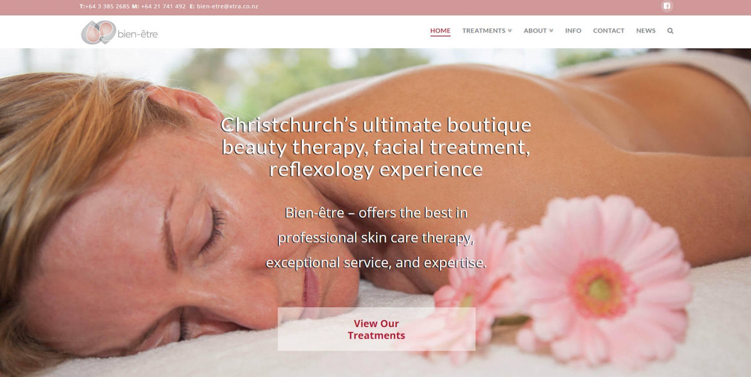
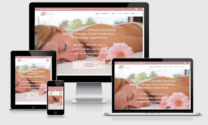
The old website is out of date and is not responsive to mobile devices. The information is outdated. Owner, beauty therapist Lia, needs to have it re-designed to reflect more closely to what the business has progressed into, with the new logo and colour scheme.
The quote was promptly accepted and the drafts made up within a few days using two different themes and sample images. It was a pleasure to meet up with Lia and discuss the pros/cons of each draft. We decided on a design which is not ultra modern and is easy to use.
Lia engaged Neill Culpan (neillphotography.nz) to have professional photos taken. We spent a few hours snapping photos of Lia and her model, her beauty products and the surrounding. The result of the combined effort is a website that is fresh, modern and fits in with the business image. The colour scheme of dusky pink and grey is used.
The website is integrated with an opt-in so visitors can be included on the mailing list. Links to book appointments or purchase Gift Certificates are conveniently located on the pages.
She immersed herself in my business and designed a website I am so very proud to promote…..She produced magnificent work in such a short space of time and I am so grateful for the generosity of her time and energies.Lia van TonderRead the full testimonial
Visit : bien-etre.co.nz
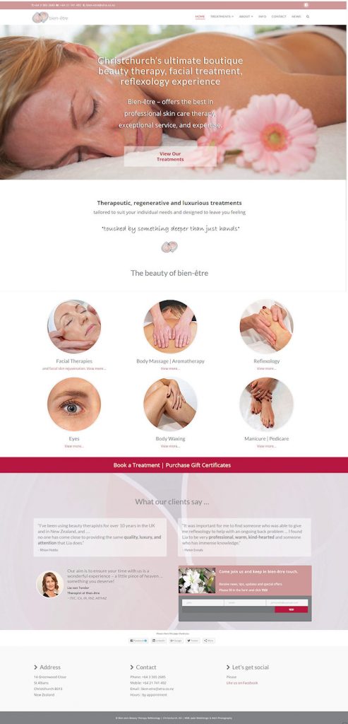
Here is a screenshot of the new website:
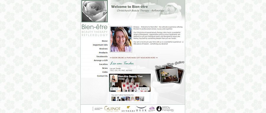
and here is the old website Home page:
If your website is outdated, consider having it re-designed with a modern system that you can keep updated yourself. Have a website that you can be proud of, to promote your business!


